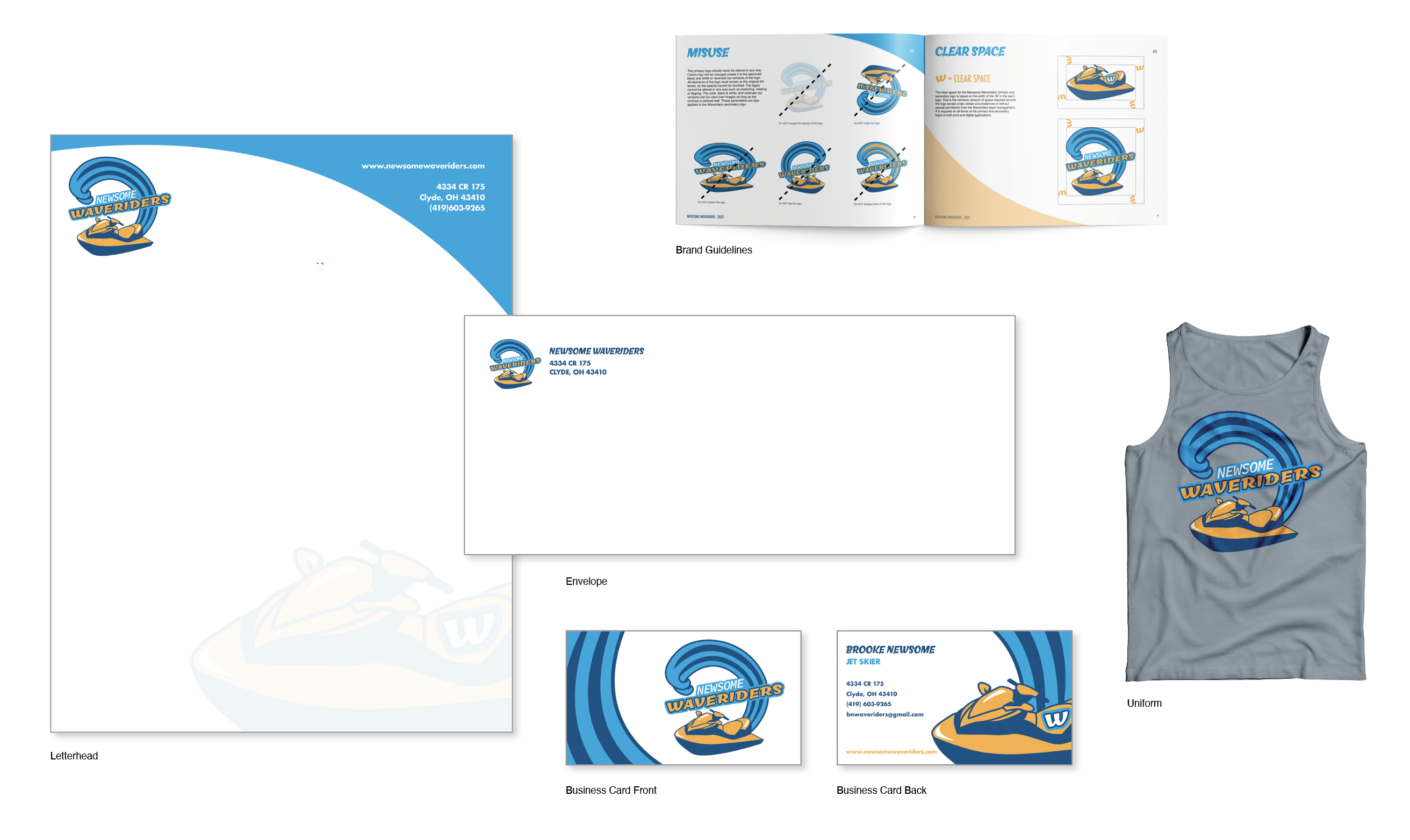
Waveriders
Branding
The Newsome Waveriders is an extreme water sports team based out of Clyde, Ohio. The team is made up of the Newsome family and friends that all have different water sports disciplines. The logo shows a crashing wave to symbolize the intensity and fierceness of the team as well as a jet ski due to the fact that it is the main vehicle the team uses. The team brand utilizes a letterhead, envelope, and personal business card design. These designs use the colors dark blue, light blue, gold, black, and white. The shades of blue represent the waves and the gold represents the warmth and energy the team gives off. Black and white are good for contrast in each design. There are multiple fonts used throughout each design. Chill Script is used for “Waveriders” in the logo due to its strong feel which adequately represents a high performance sports team while still being smooth to go along with the waves. Source Code Variable is used for the “Newsome” section of the logo because it is simple and could be easily manipulated in Illustrator. The identity systems use Futura as the font to display the contact information because it is a sans serif font that corresponds well with Chill Script. The use of curved lines throughout each of the designs promotes the water-like feel. The design is all pushed by other elements and principles such as contrast and space.
Final Design
Primary Logo Design
Secondary Logo Design
Branding Mockups
