Xtreme Xperience
Packaging Design
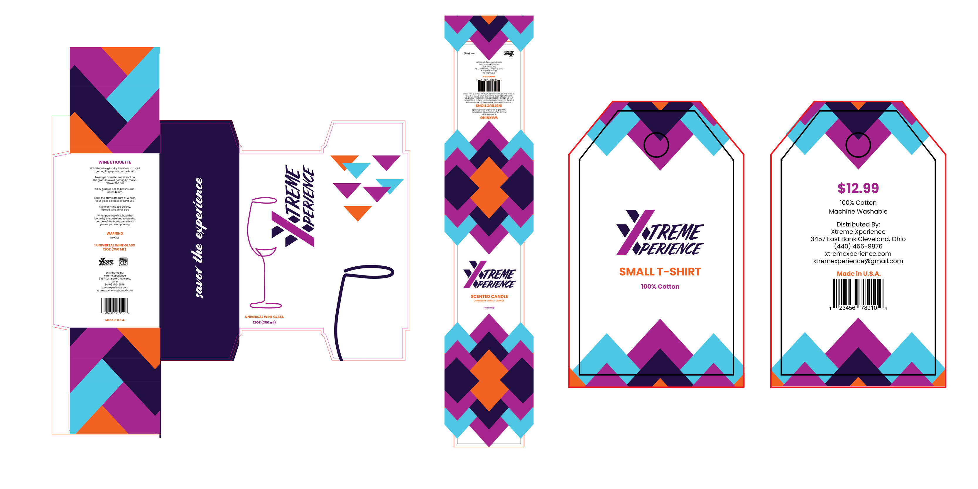
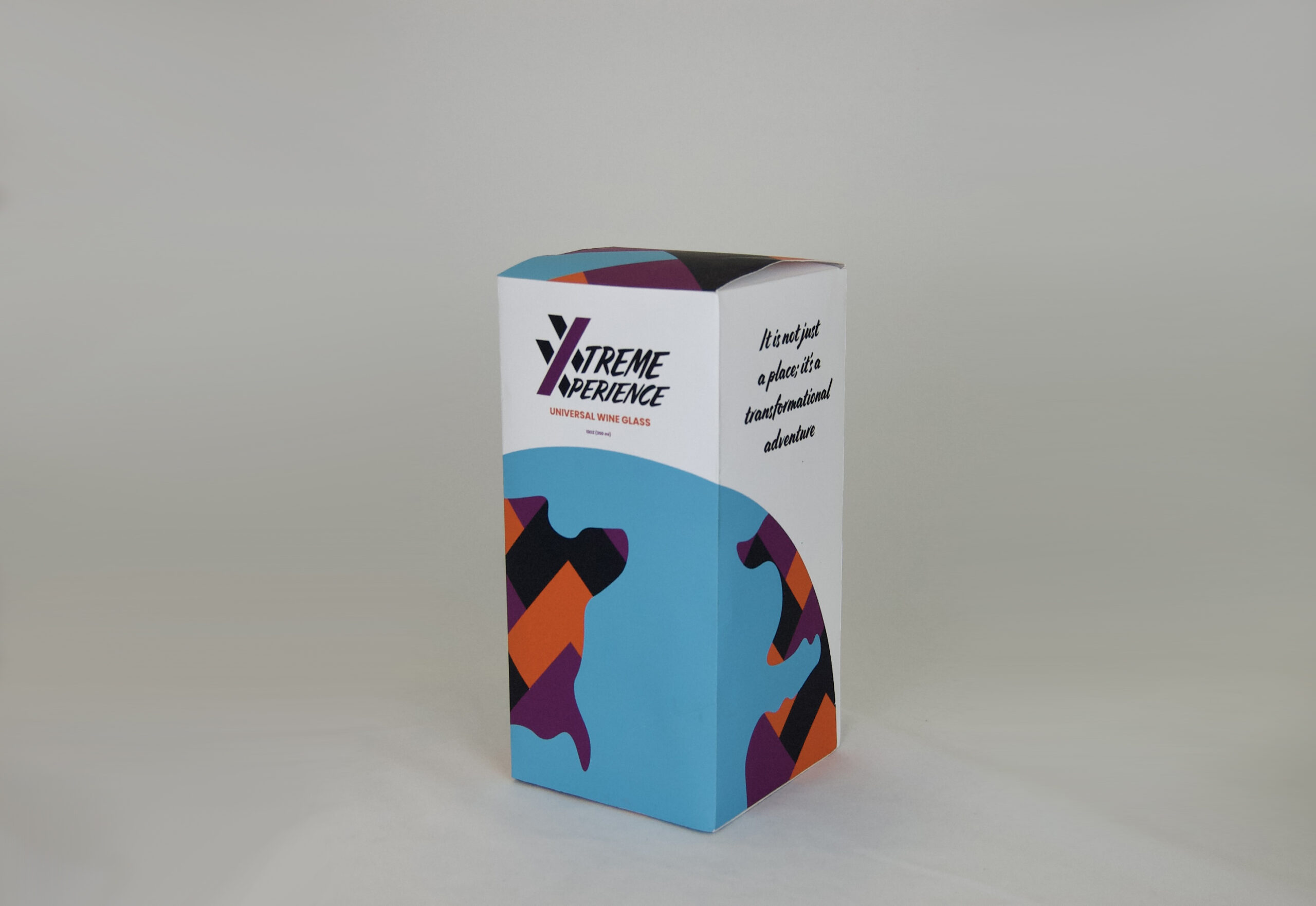
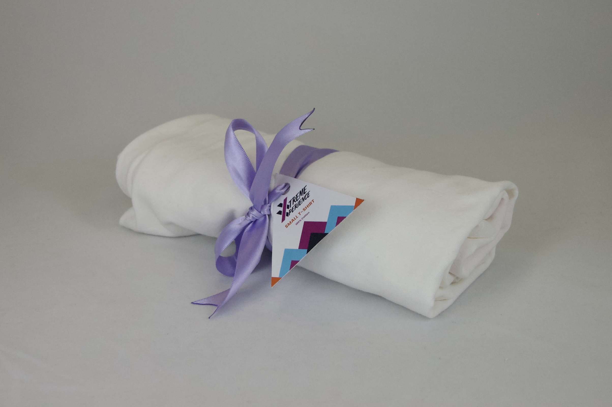
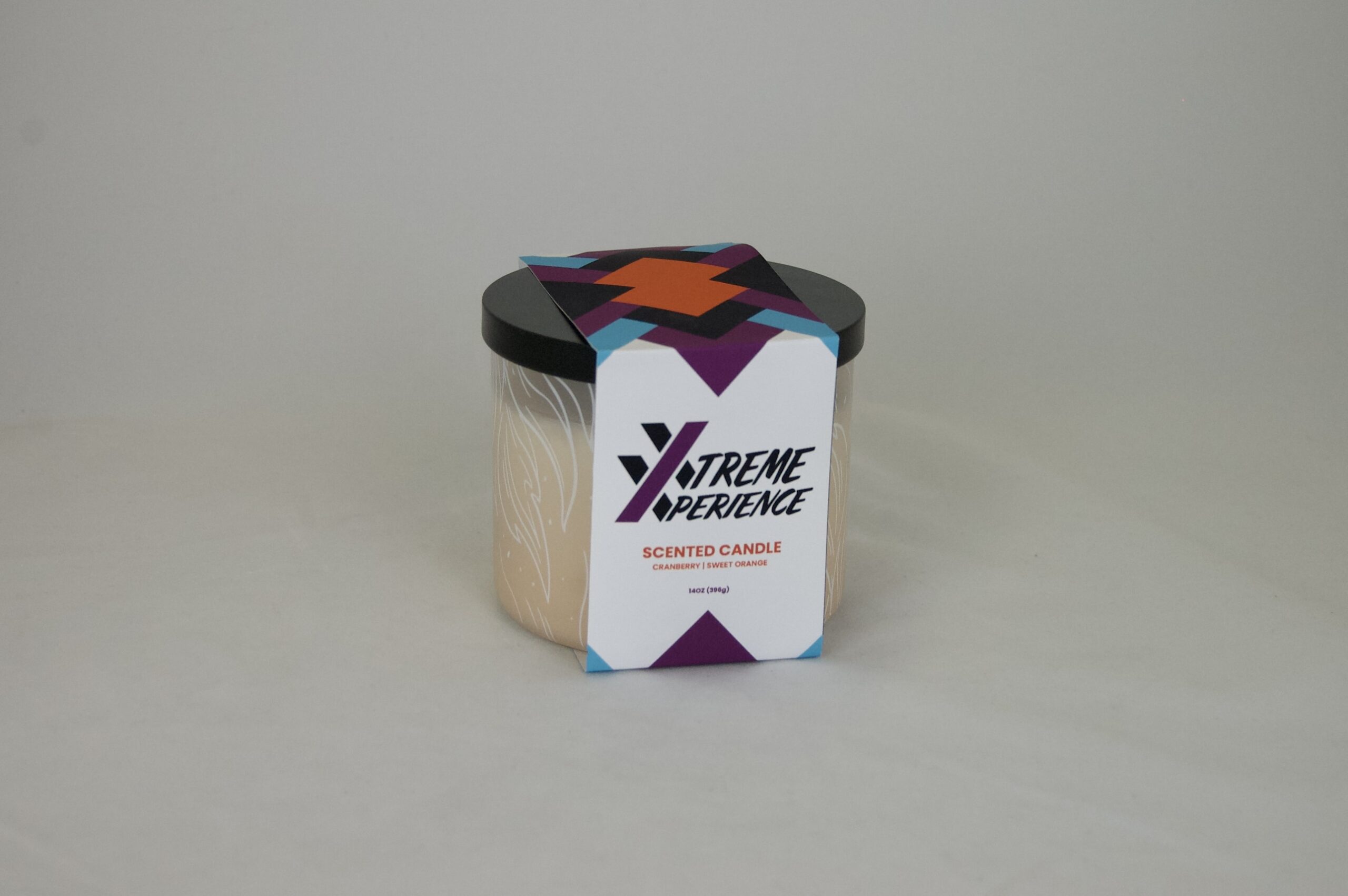
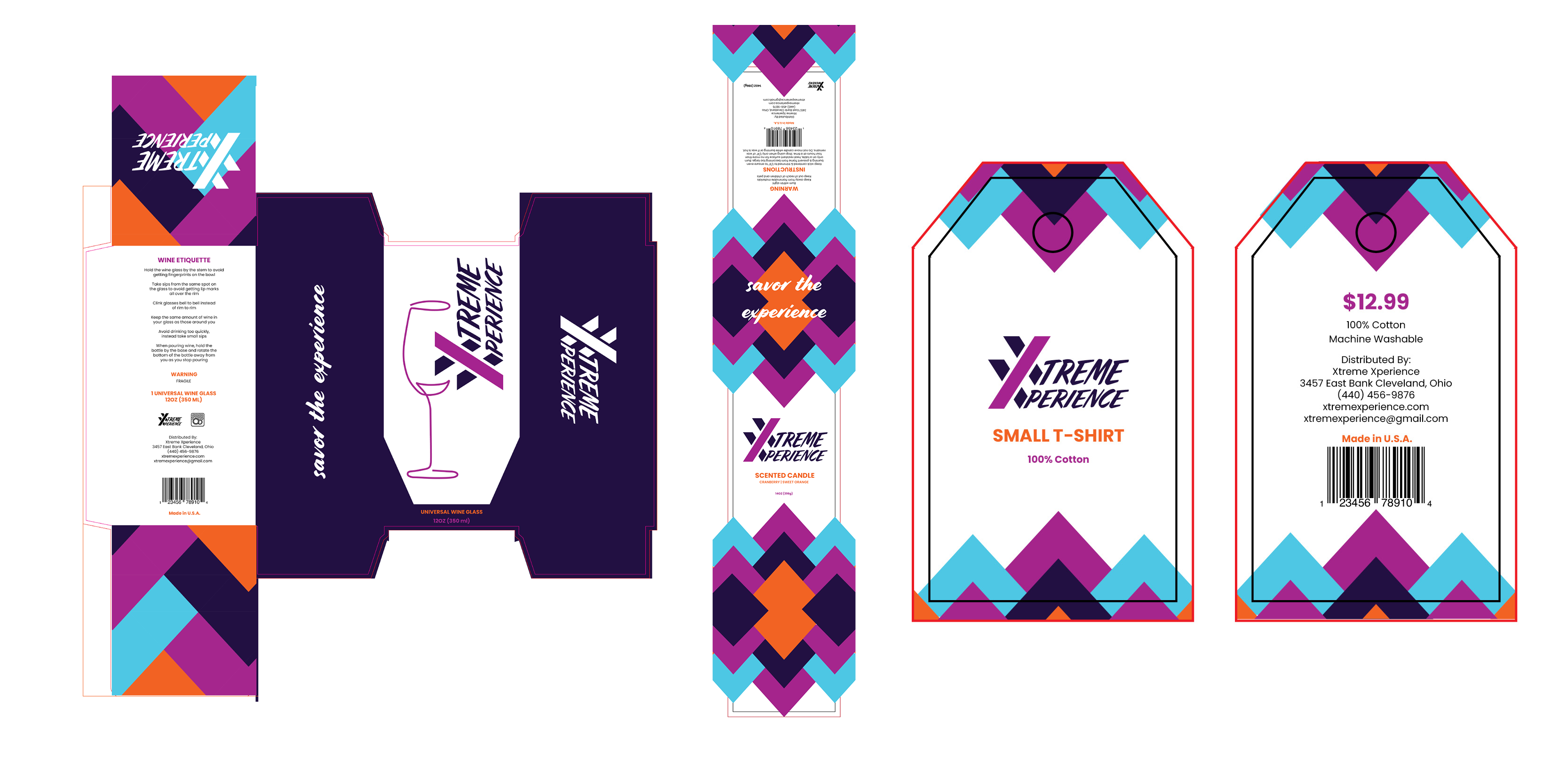
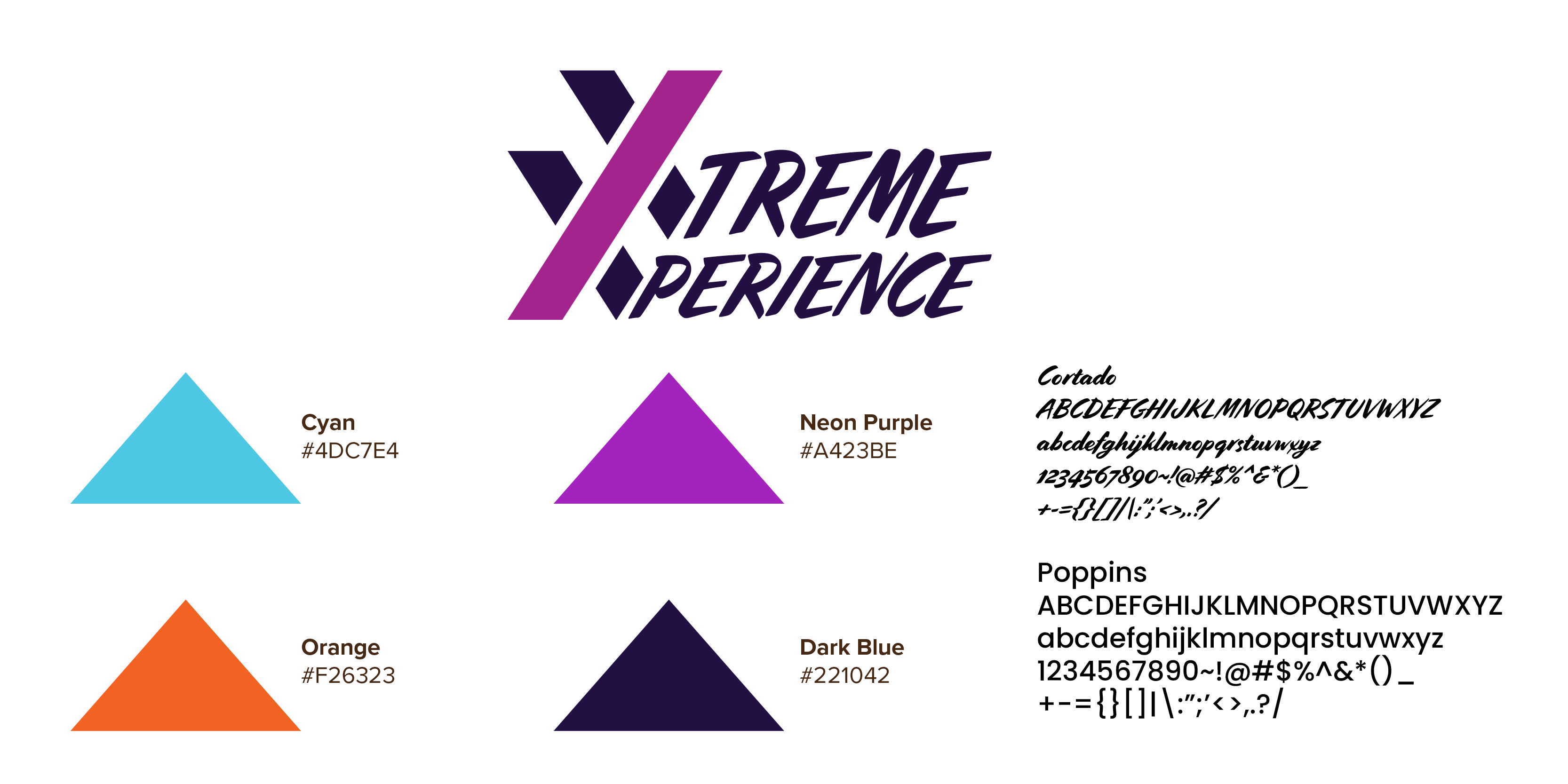
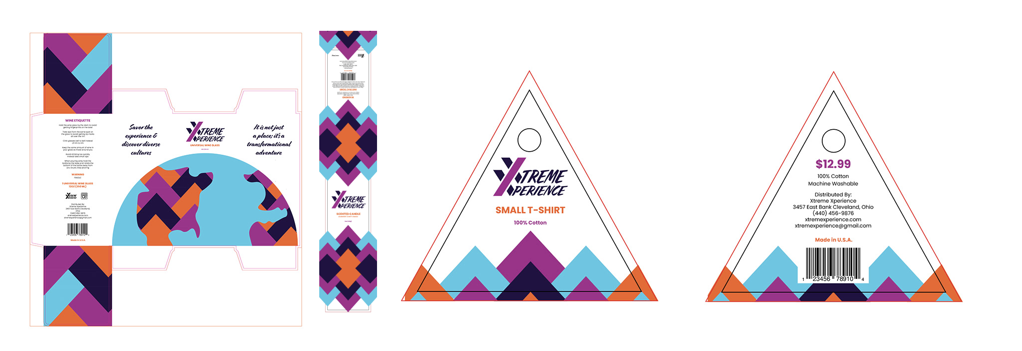
Xtreme Xperience, is a cultural night club/bar that gives Clevelanders a way to experience the world and all of its cultures while still being at home. There are drinks and taste boards from all around the world along with weekend cultural performances highlighting different regions. The logo is a double letter X illustration that creates a strong and bold feel. The words “Xtreme Xperience”, that are written in the typeface Cortado, stem off of the double X using it as the first letter of both words. The packaging then features this logo design. These box 20in x 20in flat, wrap 3.5in x 18in flat, and tag 4in x 4 flat designs contain the CMYK colors, cyan, dark purple, neon purple, and orange. These colors embody the extreme, night club life due to the brightness and saturation while creating a neon feel. The typefaces Cortado and Poppins also add to the extreme feel. The headlines are Cortado regular, which stand out in a hard and jagged way. The subheadings are Poppins bold and semi and the body copy is Poppins medium which pairs well with Cortado and is easy to read. The repeating triangle pattern is creating a rigid and edgy aesthetic which is reflecting the hard lines in the logo as well as the night club life. The earth illustration is created using the colors of the business while incorporating the triangle pattern for land. This gives the edgy feel while articulating the sense of culture. This project succeeded in creating a visually appealing way to promote the cultural bar that is Xtreme Xperience outside of its walls.
Final Design
Mockup Design
Flat Design
Process
Color & Type Study
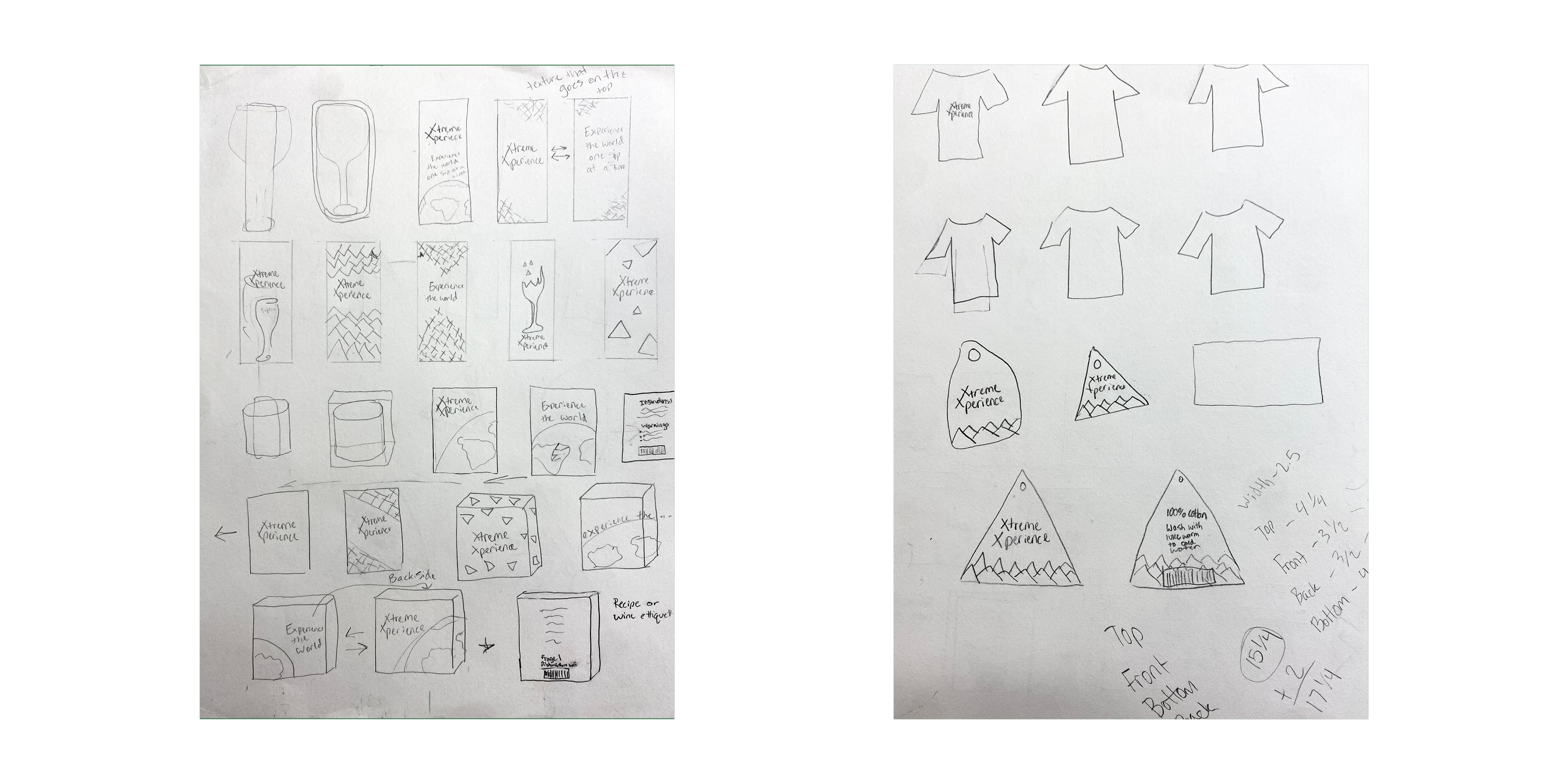
Sketches
Verison One
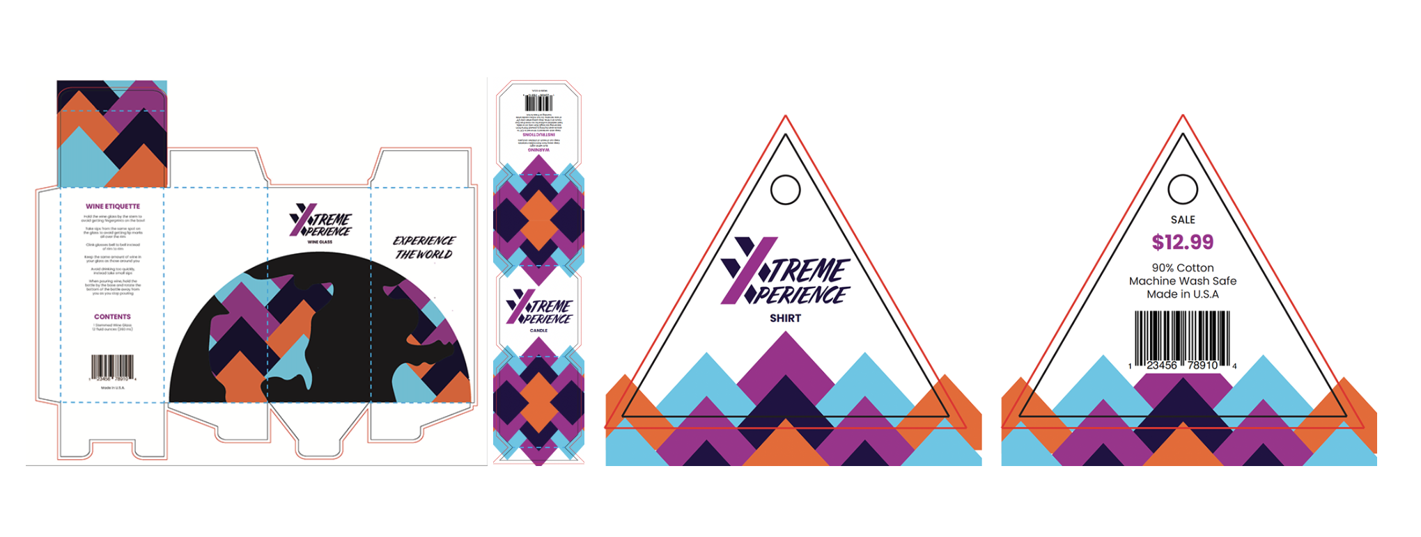
Verison Two
Verison Three
